
Concept ProjectHealthy FuelFood & Nutrition · Social + Content
Home / Our Work
PORTFOLIO · CONCEPT PROJECTSEvery piece below is a concept project, sample creative, or creative exploration — made to demonstrate our range across social, branding, campaigns, ads, and content. Filter by discipline to explore.
Showing 8 of 8 concept pieces.

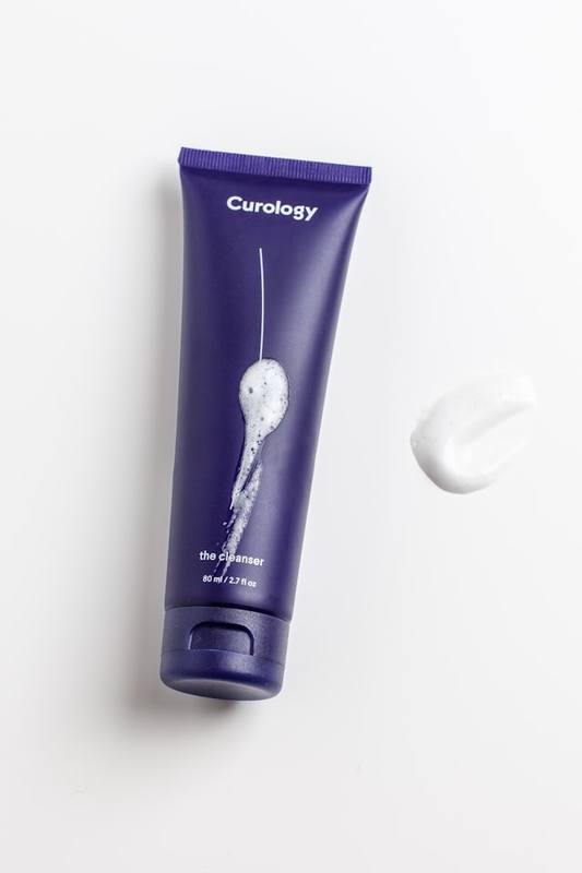





A walkthrough of our thinking on one portfolio piece — the same structure we apply to real client work. No performance figures are claimed; this demonstrates process, not results.
Skincare feeds are crowded with clinical claims and loud promises. The concept brief: communicate simplicity and trust for a fictional minimal skincare line, in one scroll-stopping visual.
Calm, clinical-minimal: soft neutrals, generous white space, one hero product. The mood says “dermatologist-approved simplicity” without a single word of jargon.
Headline-first hierarchy — “Simple Skincare. Real Results.” set large — with the product as supporting proof. Nothing competes with the message; the eye lands on words first, bottle second.
Portrait-first composition with safe zones for feed and story crops, a restrained two-typeface pairing, and a muted palette extended from the product packaging itself.
We removed an early ingredient-badge row after testing legibility at phone size — it added noise without meaning. One message survived: simplicity. The design now proves the claim structurally.
Hook variations (“3 steps. Zero confusion.”), offer-led versions for paid placements, and an educational carousel extending the same system — creative as an evolving asset, not a one-off.